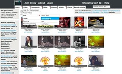
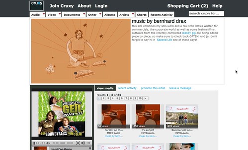
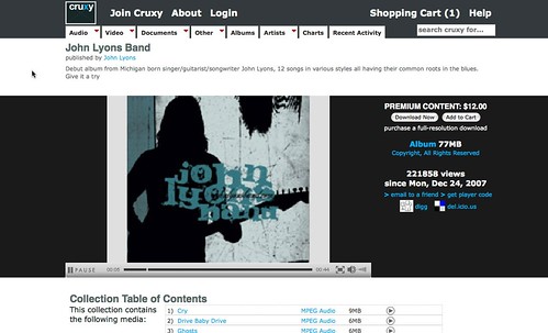
I’ve been working on a update to Cruxy that provides both a new look and feel, as well as adds some new much needed features (like a shopping cart). One of my primary goals was to improve the ability for visitors to quickly browse and scan through the listings and artists to find something they might be interested in. By moving towards a thumbnail-style layout with rollover popup info boxes and multi-level menus for quickly select a specific genre or media type, I think we’ve made progress toward that goal.
If you have any other ideas or approaches that you think that Cruxy interface could benefit from let me know!


