You might have seen a previous post about the VoteReport for Android I developed. This was done as part of the twittervotereport.com effort, which is aiming to use a variety of communication tools (sms, iphones, g1’s, plain old phone lines) along with open standards and mashup technologies to create an effective tool for tracking problems (and successes!) at the polls on November 4th.
One of the exciting aspects of this project is that the primary visionaries, architects and developers committed early on to opening up the data they are collecting, providing a variety of feeds to access the incoming reports:
Here are the various ways that you can access the data collected by Twitter Vote Report, as detailed by our Andrew Turner:
* OpenSearch – http://votereport.us/opensearch.xml
This is the OpenSearch description document that outlines all of the feeds and various filters that you can use when getting to the data.
* KML – http://votereport.us/reports.kml
Getting the reports.kml will give a Network Link – this is useful for GoogleEarth and other KML clients to automatically update every 60 seconds with new reports.
* GeoRSS-Atom – http://votereport.us/reports.atom
Just want to subscribe to the feed in your RSS reader, this feed is useful for getting updates.
* GeoJSON – http://votereport.us/reports.json
JSON is super nice for doing client-side mashups and visualization. This is what the Vote Report Map itself is using. It includes a lot of information for each report, including reporter, icon, location
I haven’t been involved in the backend development of the TVR system because a) I couldn’t fully commit to the herculean effort they’ve made and b) much of it is implemented in Ruby on Rails, a platform which I am not that familiar with. However, I had a few hours today and decided to become a consumer of the data feeds (specifically GeoJSON) they have provided to implement a service using Java/JSP. My aim was to provide an alternate system for browsing the reports and visualizing them, as well, and perhaps just act as a backup repository.
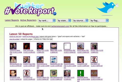
Thus, I’ve created TVR on OpenIdeals – the same data as what you’ll get on the main twittervotereport site, but with some different tools for looking through it and for sharing it on your blog.
I also wanted to provide some other options for creating widgets out of the data. Here’s an example of a dynamically updating widget you can create that displays the last 25 reports from Virginia:
Here’s a view of anyone having a bad experience at the pools:
That’s about it. Check out the site and please tomorrow make sure you 1) VOTE and 2) report how your vote went using the TVR Reporting Tools.
I’d love to be able to scroll around on your map. Your map shows all reports for my area, but the TwitterVoteReport map only shows latest 200, so they don’t appear on their map.
Chris – I’ll see what I can do… you are asking for the maps that appear at the bottom of the state view list to be dynamic so you can zoom in and pan around, etc?
Yes, exactly. When I filter for PA results, it shows the map at the bottom as a .gif; No sweat if it’s not possible. Your applications are great.
These are great! Wish I’d seen them before the election…as it was, streaming the election (especially in specific locations) was actually happening this year, thanks to sites like yours and efforts to get out the word. I’m off to visit TVR reporting tools…better late, I’m hoping…than not at all.